COVID-19 Data Visualization
Description
Our COVID-19 tracker application serves as a means for people to gain insights into pandemic trends through multiple types of data. The data comes from 3 disparate sources: Cuebiq Mobility Insights for mobility / movement data, the New York Times for daily reports on Coronavirus cases and deaths in the U.S., and the United States Census Bureau for demographic data. The central component of the visualization is the chloropleth map, in which move index data (collected from phones) is encoded by color, thus indicating how different places in the U.S. have responded to the pandemic crisis by way of social distancing as time has progressed.Details
Date: March 2020 - May 2020Team: Sejal Dua, Sook-Hee Evans, Sammy Stolzenbach
Related: #DataVisualization #Academic #COVID-19
Language(s): Javascript, Python, HTML, CSS, Shell
Tools & Technologies: D3 Library, API calls, Geolocation Detection
Highlights
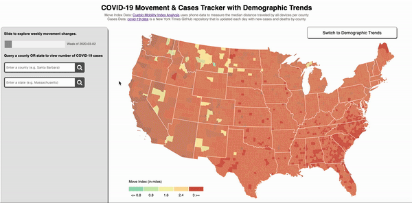
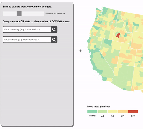
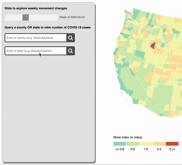
Central to our implementation is a temporal progression of the aforementioned move index data. By dragging the slider in the top left corner of the screen, the user can look at data from a specific week or control the speed at which they fast forward through time.
One of the most important and most frequently used features of our application is the animated bar chart of COVID-19 cases for a queried county. The user can query counties or click on the map to invoke this feature and explore any potential relationships between move index and increases or decreases in new cases.
After doing some user testing, it became evident that people naturally tend to want to explore data by city or by state rather than by county. Since we used third party data, we could not control how it was organized, but we could simplify the lookup process for the user. We decided to implement a donut chart depicting each county in the queried state. The size of each slice of the donut chart encodes the relative percentage of cases for each county within the given state. As can be expected, the color encodings are consistent with the move index data. There is also linking functionality that comes into play. When a user hovers over slices of the donut chart, the geographic location of those counties is highlighted on the chloropleth map. When a user clicks on a slice, the animated bar chart is displayed in lieu of the donut chart.
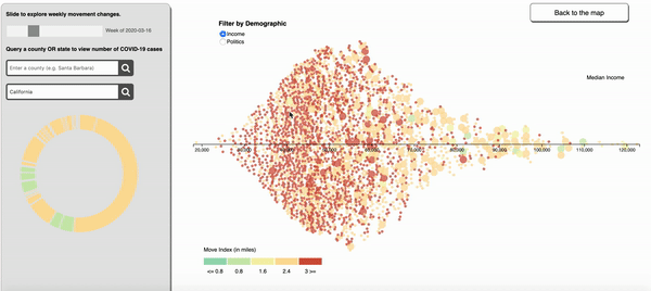
You can also click on the “Switch to Demographic Trends” button to explore how move index and case data correlate with demographic trends such as median income, political alignment, and unemployment rate. The default demographic is median income. The counties retain their coloring that matches up with the move index by week, but are aligned on an x-axis from least wealthy to most wealthy, according to the median income recorded in by the United States Census for each county. Because there is full linking functionality with case data, as there was this map, this view allows users to explore how income might affect where people are sheltering in place. These are important correlations to take note of, but we think it is even more powerful to visualize them!
Key Learnings & Reflections
incremental progressMaking small improvements each day was, by far, the most satisfying part of this project. Since we started from square one, we really had to take it one feature at a time. We learned to celebrate the little victories and use the momentum to propel us past obstacles.
Development was often happening in parallel. When team members are working on different features but modifying the same file in various places, it is essential to work on git branches and create pull requests. These best practices are put in place for a reason.
This especially holds true when are you working remotely in the middle of a global pandemic! Strong communication ensured that we were not stepping on each other's toes and that all ideas were being laid out on the table before we proceeded onward with new features.
Code refactoring is an agile programming concept that refers to the process of clarifying and simplifying the design of existing code, without changing its behavior. Un-refactored code tends to suffer due to way too many responsibilities per method or class, duplicate code, poor naming, poor commenting, and general confusion. To illustrate a popular metaphor, refactoring is like cleaning the kitchen as you cook or shortly after you finish cooking. The dishes, pots, food, and refrigerator must all be clean and organized from moment to moment. Without maintaining a clean kitchen, continuous cooking would either be infeasible or highly unpleasant. Similarly, developing new features is about 10x harder than it should be if the code is not refactored. We had to sit with the code and think about how to best modularize it to make it as reusable as possible. Make no mistake, it is not super clean even today. But the point here is that code refactoring is a continuous process, and it should not be overlooked.
Bash scripts are plain text files which contain a series of commands that we would normally type out ourselves on the command line, but would rather clump together in a file to execute many tasks all at once. This is a very simple hack that saves us lots of time and minimizes errors in file system organization.
The open source community makes me believe in the goodness of humanity. It is so powerful to be able to play with demos, clone repositories, and ask for help in online forums so that we, as a community, can push forward into new domains without ever having to reinvent the wheel. Huge shoutout to the anonymous heroes on Stack Overflow who got us through this project. One day, I hope to pay it forward.