2025-Present
Courtside
A web scoreboard for NBA and WNBA that looks and feels like a terminal: monospace, keyboard-driven, no frills, with mobile gestures layered on top.
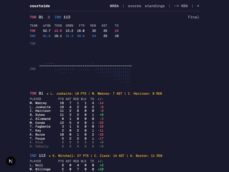
Overview
Courtside started as a Go terminal app that I check scores with most nights during the season. It opens instantly, fits a whole slate on one screen, and never asks me to dismiss anything. The web version came out of wanting that same thing on my phone and in a browser tab, so I kept the monospace layout, the team-colored tricodes, and the keyboard shortcuts, and left the rest behind. It pulls from the NBA and WNBA CDN every 15 seconds for scores, box scores, play-by-play, and standings. Requests go through Next.js API handlers that deal with CORS, caching, and rate limiting, so the browser never hits the CDN directly. j and k move through games, enter opens one, w flips leagues, t swaps the theme, and on a phone you swipe between days. If you have used the terminal version, your muscle memory still works.
Challenge
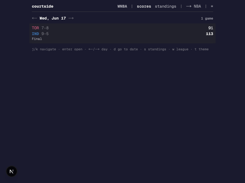
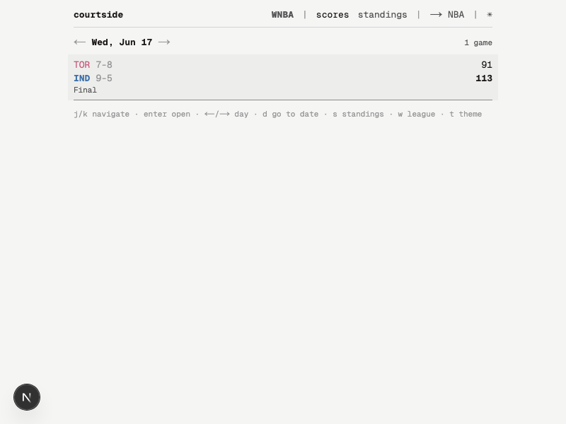
A terminal gets to assume 80 columns and a fixed-width font. A browser gives you none of that, so I had to figure out which parts were actually load-bearing. The monospace alignment, the density, and the keyboard shortcuts stayed. Everything else bent: the layout reflows on small screens, tap targets got bigger, swipe handles day navigation, and the stat tables collapse so nobody has to scroll past 200 numbers on a phone to find a score. The data layer took longer than the interface. The NBA CDN rejects requests that arrive without the right Referer and User-Agent headers, and a browser cannot set either one on a cross-origin fetch. The stats.nba.com endpoints for older dates are unreachable from most hosting providers no matter what you send them. So the app runs a server-side proxy with two layers of caching and a fallback path for when the primary endpoint gives up.
Approach
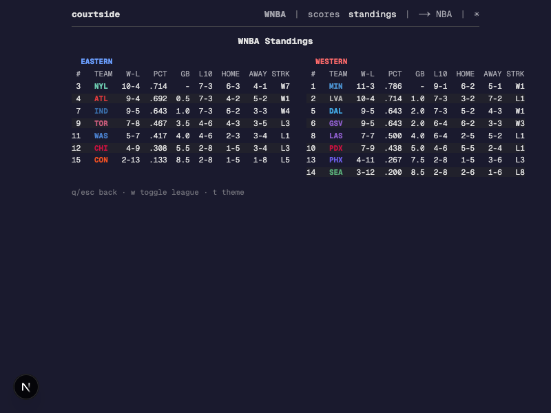
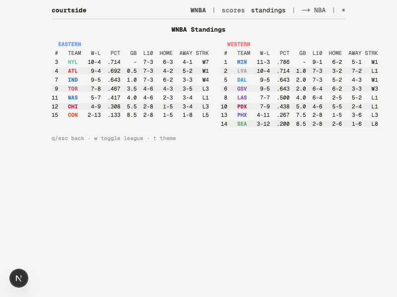
Three decisions shaped most of the rest. The first was density. A game is two lines of text and the standings are a fixed-width table. No cards, no rounded corners, no skeleton loaders. Alignment, color, and whitespace do the work, which is all a terminal ever had to work with anyway. The second was treating both input modes as real. Every interaction has a keyboard shortcut that matches the TUI, and mobile gets swipe for day navigation, tap to open a game, and actual buttons for expanding stats and switching themes. I did not want either one to feel bolted on after the fact. The third was color, which turned out to be the fussiest part of the build. Team colors that read well on black disappear on white, and Timberwolves navy is the worst offender. Instead of computing brightness at runtime, I hand-tuned two color maps: brightened variants for dark mode and darkened brand colors for light. The rest of the UI swaps through CSS variables on a data-theme attribute. On the server side, the proxy caches responses in memory with a 15 second TTL and limits each IP to 100 requests a minute, with Vercel edge caching sitting in front of that.
Impact
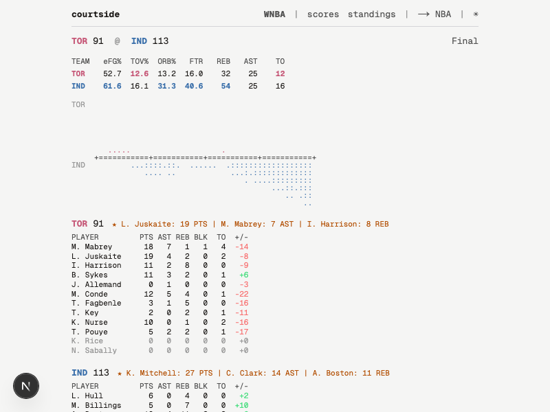
This is what I actually use to follow games. It loads in under a second, stays current with 15 second polling, and behaves the same on my laptop as it does on my phone. What I like most is how little it does. I get Four Factors, box scores with colored plus-minus, an ASCII game flow chart, and play-by-play in reverse chronological order. There are no ads, no autoplaying video, and no banner asking me to download an app I am already using.
Previous
← Game Excitement Index