2020
COVID-19 Data Visualization
Interactive tracker combining mobility data, case counts, and demographics to visualize pandemic trends across US counties.
Overview
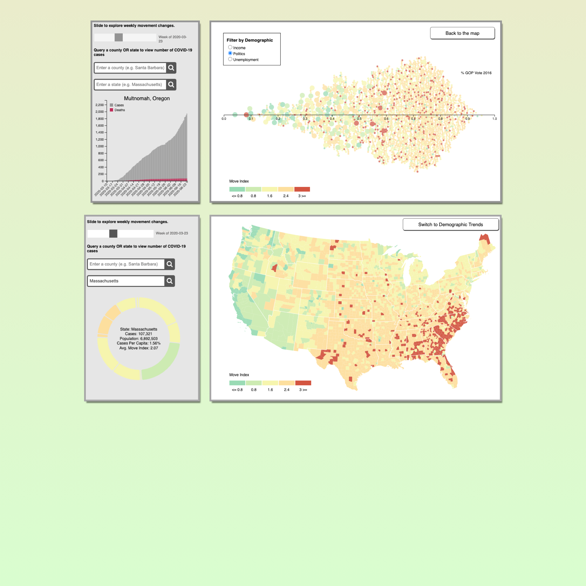
In Spring 2020, public health data was abundant but hard to contextualize. Case counts alone didn't tell you how communities were actually responding. I built an interactive tracker that fused three data sources (Cuebiq Mobility Insights for movement data, the New York Times for daily case reports, and the US Census Bureau for demographics) to let users explore the relationship between how much people moved and how cases spread, county by county.
Challenge
The data sources updated on different cadences, used different geographic granularities, and had different missing-data patterns. Combining them into a single coherent visualization required careful temporal alignment and normalization. The tool also needed to be accessible to a general audience, not just data scientists.
Approach
Built with D3.js as a single-page interactive application. The centerpiece is a choropleth map encoding mobility index by color, overlaid with case count data. A temporal slider lets users scrub through weeks of the pandemic. Clicking a county reveals animated bar charts of local case progression and demographic context. The entire pipeline (data ingestion, cleaning, and rendering) runs client-side.
Impact
Published as a live interactive tool and written up as a detailed walkthrough in Towards Data Science. The article was one of my first technical publications and introduced the project to a wider audience interested in pandemic data visualization.
Previous
← Penciv